Understanding market sentiment has always been a crucial part of financial analysis. Traditionally, analysts relied heavily on raw price and volume data to determine the prevailing mood of the market. However, in the crypto space, where minor trends shift quickly and investor behavior is highly reactive, traditional quantitative methods often fail to capture the full picture.
The crypto market is deeply intertwined with fast-moving information flows. News, announcements, social-media activity, and geopolitical events can influence sentiment within minutes. This raises an important question:
Should we quantify market sentiment directly from news flows, rather than relying solely on market data?
The Problem
1. Human Nature
Investor decisions are influenced by cognitive biases and emotional reactions, a foundational principle of behavioral finance. In markets with rapid information turnover, such as crypto, these emotional responses often amplify price movements. As more participants react in similar ways, their collective behavior directly impacts market sentiment.
2. Speculation and Information Flow
Speculative news, rumors, and unverified claims can cause noticeable shifts in crypto asset prices.
Today, information spreads faster than ever through social media, messaging platforms, and online communities. While not all individuals can move markets, high-reach sources or coordinated sentiment waves can significantly influence short-term price dynamics. Regulatory oversight in this area is still evolving, which means sentiment-driven volatility remains common.
3. Geopolitical and Macroeconomic Influence
These factors demonstrate that relying only on raw price data is insufficient. Market sentiment is shaped by human behavior and news flow, and both must be taken into account.
The Solution: Quantifying News Sentiment
To assess news sentiment properly, several key dimensions must be considered:
1. News Source Credibility
Not all sources carry the same weight. Professional investors often prioritize reputable financial news outlets, institutional reports, or verified announcements.
However, social media still plays a role as a sentiment indicator, especially in crypto. The goal is not to ignore it, but to weight sources according to credibility.
2. Geographic and Economic Origin
The impact of news often depends on its origin.
Announcements from major economies or major regulatory bodies (e.g., the U.S., EU, China) tend to have broader influence.
In contrast, news tied to smaller markets may only affect local regions or specific projects. A proper sentiment model must account for this.
3. Author / Publisher Credibility
Some authors, analysts, and institutions have historically reliable information or closer industry access. Others publish speculative or low-quality content. Quantifying sentiment must therefore include an author credibility score.
4. Scope and Relevance of the News
Not all news affects the whole market.
Examples:
-
A protocol upgrade may only influence the associated token.
-
A global regulatory announcement can shift sentiment across the entire market.
-
A hack, lawsuit, or exchange outage may impact specific sectors.
Sentiment classification must distinguish between token-specific, sector-specific, and market-wide news.
5. Market Impact Considerations
Even strong sentiment in one area does not necessarily affect broader market trends. The model must determine whether the news has potential market impact or is isolated to a niche asset.
The Rules: Building a Quantitative Sentiment Score
To classify news sentiment reliably, we define a set of rules.
Each rule evaluates one dimension (e.g., source quality, relevance, impact scope) and outputs an integer score.
All rule outputs are then combined into a single normalized sentiment score within a defined range:
−100 = Very Bearish
−50 = Bearish
0 = Neutral
+50 = Bullish
+100 = Very Bullish
Normalization ensures that the scoring system never outputs values outside the intended sentiment categories.
The Math Question: How Strong Is the Sentiment?
As we finish designing the rules, we need to consider the distance between the calculated value and the category threshold
Example:
If Neutral = 0 and Bullish = +50, a score of +25 lies halfway between the two.
But what does “halfway bullish” mean quantitatively?
Here we distinguish two scenarios:
Case 1 — Few News Samples (Assumed Distribution)
When only a small number of news items have been scored, we do not know the true distribution of sentiment.
In this early stage, we make a working assumption:
Sentiment scores follow a distribution roughly centered around 0 (neutral), within the defined range −100,+100
This allows us to:
-
Map scores to percentiles using an assumed normal distribution.
-
Measure intensity (distance from neutral) in a consistent mathematical way.
-
Use Fibonacci thresholds (0.236, 0.382, 0.618, etc.) to classify sentiment intensity.
This is a temporary model-based solution until sufficient data accumulates.
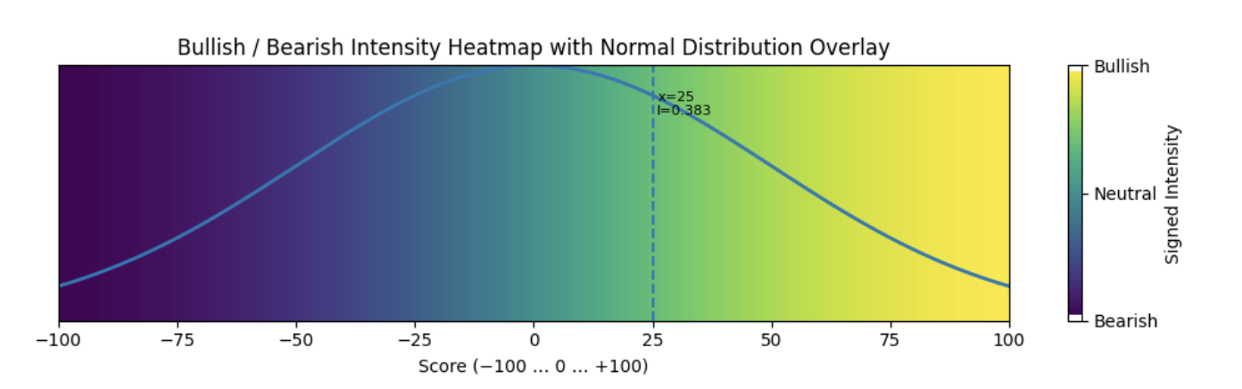 Case 1 Threshold Heatmap
Under the normal-distribution assumption, we expect the majority of news sentiment scores to fall within a mild-to-moderate range. Statistically, approximately 95% of values lie within ±2 standard deviations of the mean, which corresponds to the mid-sentiment zone in our normalized −100,+100- threshold model.
Case 2 — Sufficient News Samples (Data-Driven Distribution)
Once the system has collected enough news scores (e.g., 20+, ideally 100+), we switch to a data-driven approach using the empirical distribution:
The ECDF (Empirical Cumulative Distribution Function) shows exactly how extreme or typical a new score is compared to all past news items.
This method:
-
Requires no assumptions.
-
Adapts automatically to market regimes.
-
Allows thresholds to shift dynamically based on real sentiment data.
We still apply Fibonacci levels — but now they act on the empirical intensity, not an assumed curve.
As the model collects more news samples, we expect the majority of them to fall into the mild or moderate zones, simply because extreme sentiment events occur far less frequently. This is not assumed but learned directly from the empirical distribution of the data.
A Novel Addition: Fibonacci-Based Classification
To translate quantitative intensity into clear categories (mild, moderate, strong), we apply Fibonacci retracement levels as thresholds.
This creates stable “sentiment bands” that reflect the strength of the news relative to the overall sentiment distribution.
It is unconventional but mathematically sound, intuitive, and well-suited for the nonlinear behavior of crypto markets.
Conclusion
The crypto market’s sensitivity to news flow, combined with rapid information diffusion and human behavioral biases, makes raw price data insufficient for real sentiment analysis.
A robust sentiment model must:
-
score each news item based on structured rules,
-
normalize the score into an interpretable range,
-
and quantify intensity using either
assumed normal distribution (early phase) or
empirical distribution (mature phase).
In the initial phase, when we assume a normal distribution, around 95% of all news sentiment scores should fall within the mild-to-moderate range. Later, as the model accumulates real data, the empirical distribution naturally reflects the same pattern: extreme bullish or bearish events remain rare, while most news items cluster in the mid-sentiment zone.
This hybrid approach allows sentiment quantification to adapt as the system learns from the news feed itself, resulting in a more accurate, data-driven market sentiment engine.
Practical Example: Sentiment Trend Indicator
To demonstrate how the full sentiment framework described above works in practice, we apply the scoring model to real news flow and aggregate the results into a regression-smoothed sentiment trend. The output is plotted against the BTC price to show how informational pressure evolves over time.
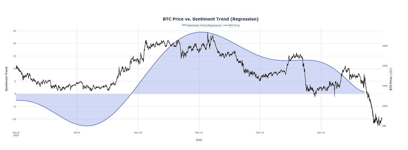
This indicator incorporates:
-
the rule-based scoring system,
-
normalization into the −100,+100 scale,
-
empirical scaling using ECDF (or the normal-distribution assumption in early stages),
-
sentiment intensity classification using Fibonacci thresholds, and
-
trend smoothing through regression.
The combined result is a sentiment curve that provides a contextual view of the market’s informational environment, complementing traditional price-only analysis.
This visualization illustrates how the sentiment trend reacts as new articles are processed.
Positive news flow gradually shifts the curve upward (bullish sentiment), while negative or risk-driven news moves it downward (bearish sentiment).
This sentiment trend indicator is also the basis of an upcoming sentiment analytics product that we are preparing to launch. It will continuously analyze live news flows, apply the rule-based scoring and empirical scaling methods described above, and generate real-time sentiment trend insights for traders, researchers, and institutional users. By combining structured logic with dynamic data-driven modeling, the system is designed to deliver an accurate, transparent, and explainable view of how informational pressure evolves across the crypto market.
Code Examples:
CASE 1
def intensity_class(x, sigma=50):
    # Compute z-score
    z = x / sigma

    # Normal CDF
    p = norm.cdf(z)

    # Symmetric intensity around neutral
    I = abs(p - 0.5) / 0.5   # range 0 → 1

    # 4. Fibonacci thresholds
    if I < 0.236:
        label = “Neutral”
    elif I < 0.382:
        label = “Mild Bullish” if x > 0 else “Mild Bearish”
    elif I < 0.618:
        label = “Moderate Bullish” if x > 0 else “Moderate Bearish”
    else:
        label = “Strong Bullish” if x > 0 else “Strong Bearish”

    return I, label

intensity, classification = intensity_class(25)
intensity, classification = intensity_class(-25)
When we run the calculation for the calculated value of the news sentiment 25, we get:
intensity: 0.38292492254802624 classification: Moderate Bullish
Same thing when we calculate with -25, we get:
intensity: 0.38292492254802624 classification: Moderate Bearish
CASE 2
class SignalScaler:
    def __init__(self, window_size=None):
        “”“
        window_size: if not None, use only last N observations (rolling ECDF).
        “”“
        self.window_size = window_size
        self.values = np.array([])

    def fit(self, values):
        “”“Initialize with historical scores.”“”
        values = np.asarray(values, dtype=float)
        self.values = values if self.window_size is None else values[-self.window_size:]
        return self

    def update(self, x):
        “”“Add a new observation and keep window_size if set.”“”
        x = float(x)
        if self.values.size == 0:
            self.values = np.array([x])
        else:
            self.values = np.append(self.values, x)
        if self.window_size is not None and self.values.size > self.window_size:
            self.values = self.values[-self.window_size:]

    def _ecdf(self, x):
        “”“Empirical CDF P(X <= x).”“”
        if self.values.size == 0:
            return 0.5
        return (self.values <= x).mean()

    def transform(self, x):
        “”“Return percentile, intensity, side and Fibonacci band for x.”“”
        x = float(x)
        p = self._ecdf(x)
        intensity = abs(p - 0.5) / 0.5

        # side by value sign
        if x > 0:
            side = “bullish”
        elif x < 0:
            side = “bearish”
            intensity = intensity
        else:
            side = “neutral”

        signed_intensity = intensity * (1 if side == “bullish”
                                        else -1 if side == “bearish”
                                        else 0)

        # Fibonacci-based bands on intensity
        I = intensity
        if I <= 0.236:
            band = “neutral_or_very_mild”
        elif I <= 0.382:
            band = “mild”
        elif I <= 0.618:
            band = “moderate”
        elif I <= 0.786:
            band = “strong”
        else:
            band = “very_strong”

        return {
            “value”: x,
            “p”: p,
            “intensity”: intensity,
            “signed_intensity”: signed_intensity,
            “side”: side,
            “band”: band,
        }
Example Usage:
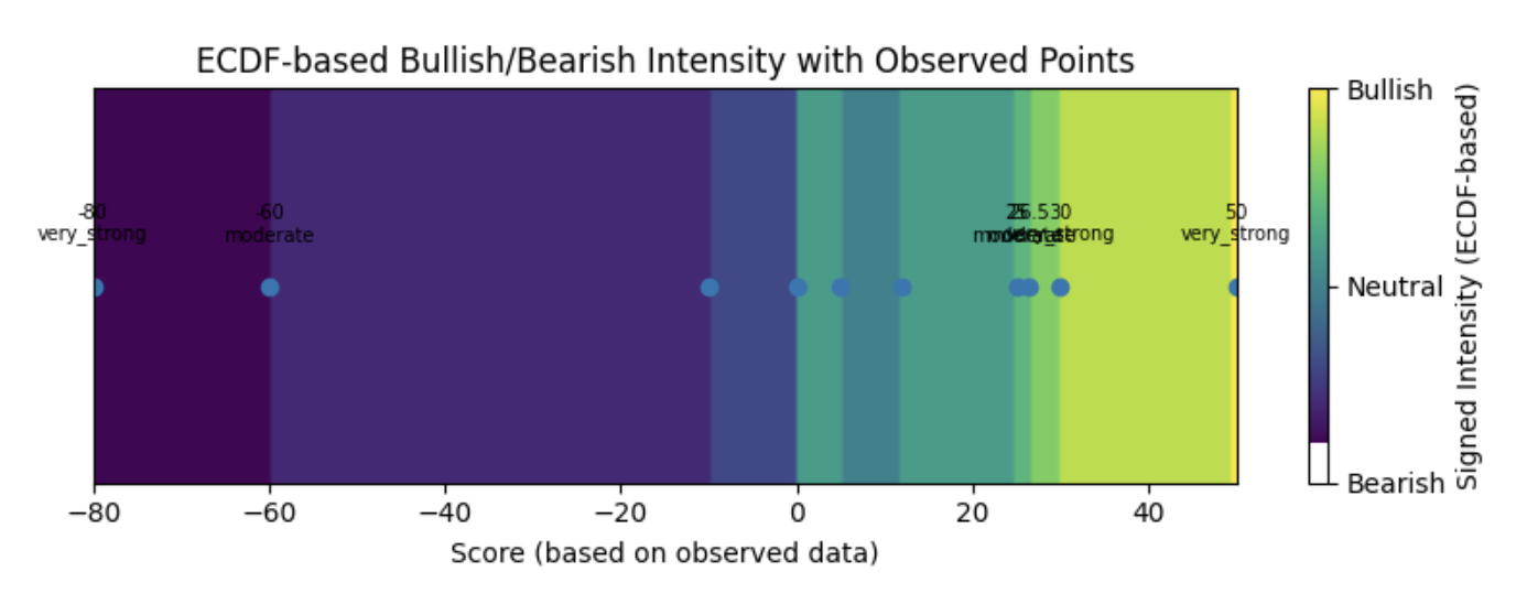
‘’‘observed calculated values’‘’
observed_data = [-80, -60, -10, 0, 5, 12, 25, 26.5, 30, 50]
scaler = SignalScaler().fit(observed_data)
‘’‘interpret some example values’‘’
examples = [25, 26.5, 30, 50, -30, -80]
for x in examples:
print(scaler.transform(x))We have included an update() method in the class so the scaling can be updated with each newly observed value.
In the example below, we use a set of “observed_data” to build the empirical distribution. Then we evaluate several example values. The results are:
{’value’: 25.0,  ‘p’: 0.7, ‘intensity’: 0.399, ‘signed_intensity’: 0.399, ‘side’: ‘bullish’, ‘band’: ‘moderate’}
{’value’: 26.5,  ‘p’: 0.8, ‘intensity’: 0.60,  ‘signed_intensity’: 0.60,  ‘side’: ‘bullish’, ‘band’: ‘moderate’}
{’value’: 30.0,  ‘p’: 0.9, ‘intensity’: 0.8,   ‘signed_intensity’: 0.8,   ‘side’: ‘bullish’, ‘band’: ‘very_strong’}
{’value’: 50.0,  ‘p’: 1.0, ‘intensity’: 1.0,   ‘signed_intensity’: 1.0,   ‘side’: ‘bullish’, ‘band’: ‘very_strong’}
{’value’: -30.0, ‘p’: 0.2, ‘intensity’: 0.6,   ‘signed_intensity’: -0.6,  ‘side’: ‘bearish’, ‘band’: ‘moderate’}
{’value’: -80.0, ‘p’: 0.1, ‘intensity’: 0.8,   ‘signed_intensity’: -0.8,  ‘side’: ‘bearish’, ‘band’: ‘very_strong’}
In this method, we determine the side (bullish or bearish) solely based on the sign of the score relative to 0.
Next, we compute the intensity using the empirical percentile (p), and then classify it into a sentiment band using Fibonacci-based thresholds.